Designing a more effective landing page
Client
Root Insurance
California Customer landing page
Services
Design and copy changes
strategy
project lead
SUMMary:
I proposed design and copy changes for our california customer landing page,
resulting in 19% more conversions and 2x session time.
01 - Background:
Poor landing page conversions
Growth marketing ads had been live in California for a few months and the team was seeing decent traffic being sent to the landing page.
Unfortunately, Root’s profile creation rate (conversions) was poor, signaling that customers were curious enough to click on the ads, but disengaging after hitting the landing page.
02 - Strategy and establishing a new performance baseline
After evaluating each segment of the landing page, I believed a few updates could eliminate potential friction points in the sign-up process and better communicate the conveniences, features, and benefits of Root to potential customers.
My theory: With a more streamlined and product-focused landing page, customers would be more compelled to create a profile and continue down our funnel.
Primary KPI: Customer profiles created (conversions)
Possible areas TO IMPROVE
Copy and image updates
Apply recent learnings from other web and copy tests as well as Growth team observations
Eliminate redundancy
For landing page testing, the team normally implemented a single change and then measured the results. This process could take 4-7 weeks to reach statistical significance.
For this test, the team agreed My proposed changes worked together to make an overall better landing page experience. So rather than testing a single copy line, image, and/or section change each time for the next 5 months, the team decided to test the new layout as a whole.
If successful, California’s design could then be used to establish a new baseline for other state pages to follow.
03 - REsults:
+19% conversions, 2x session time
The team was hoping to see at least a 7% increase in profile creations like we had seen with the organic homepage, after adding a testimonial section. Instead, we saw nearly a 20% increase over the previous layout, while also doubling user page session time.
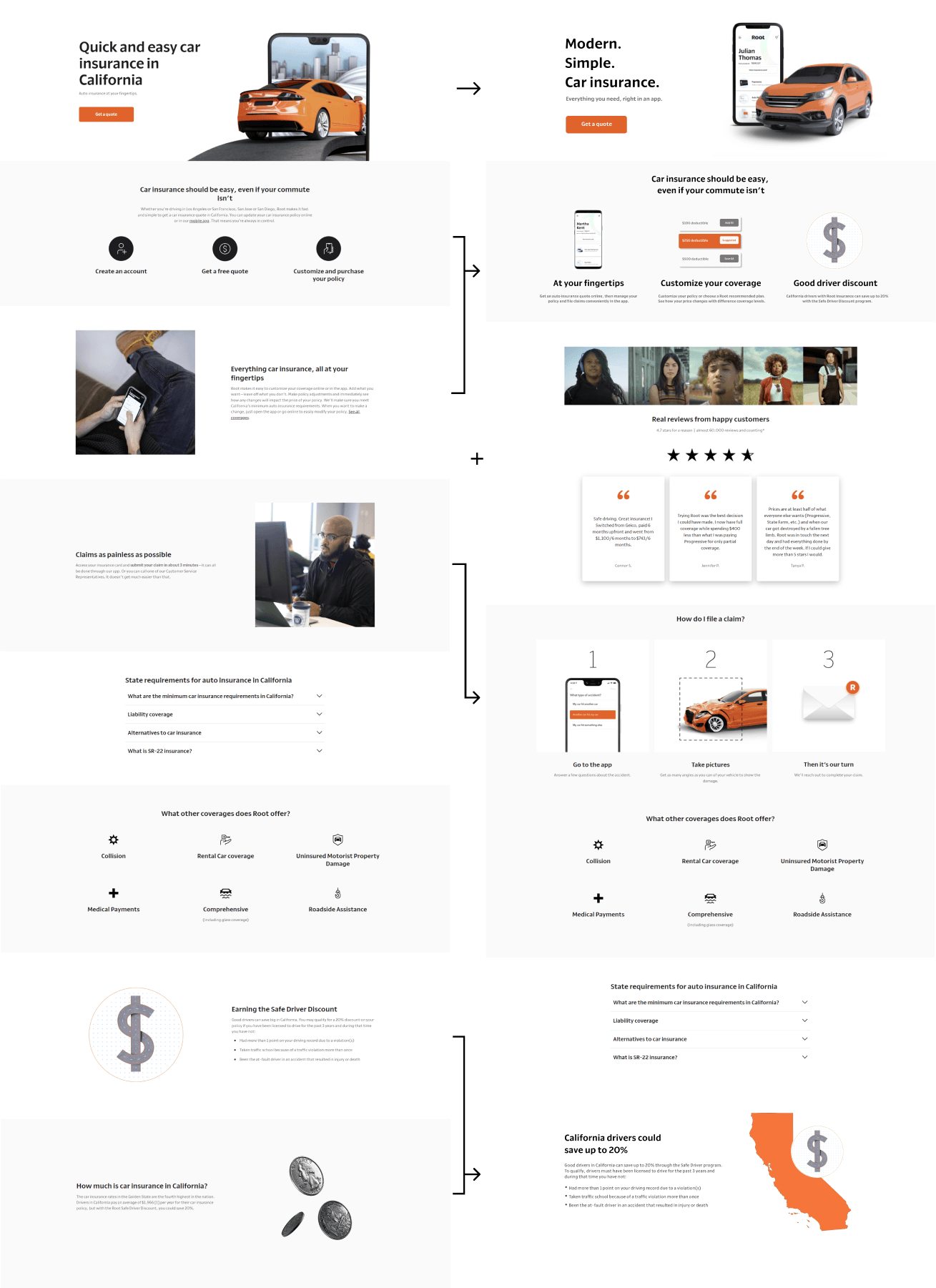
04 - Old vs Updated layout
previous


updated
05 - update details
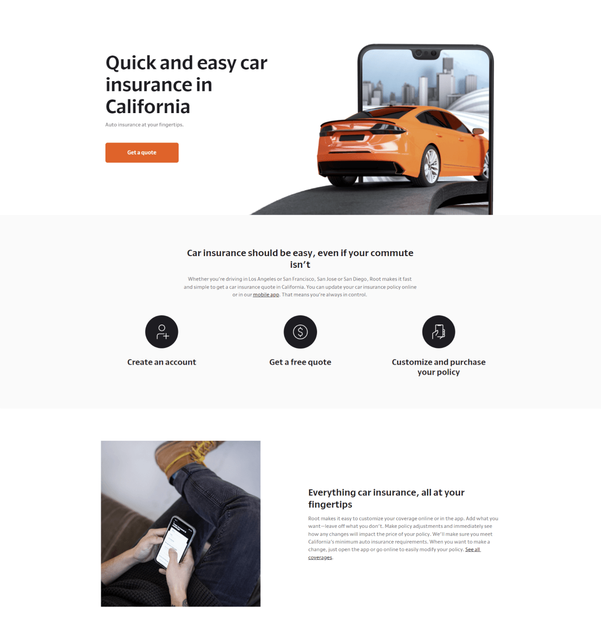
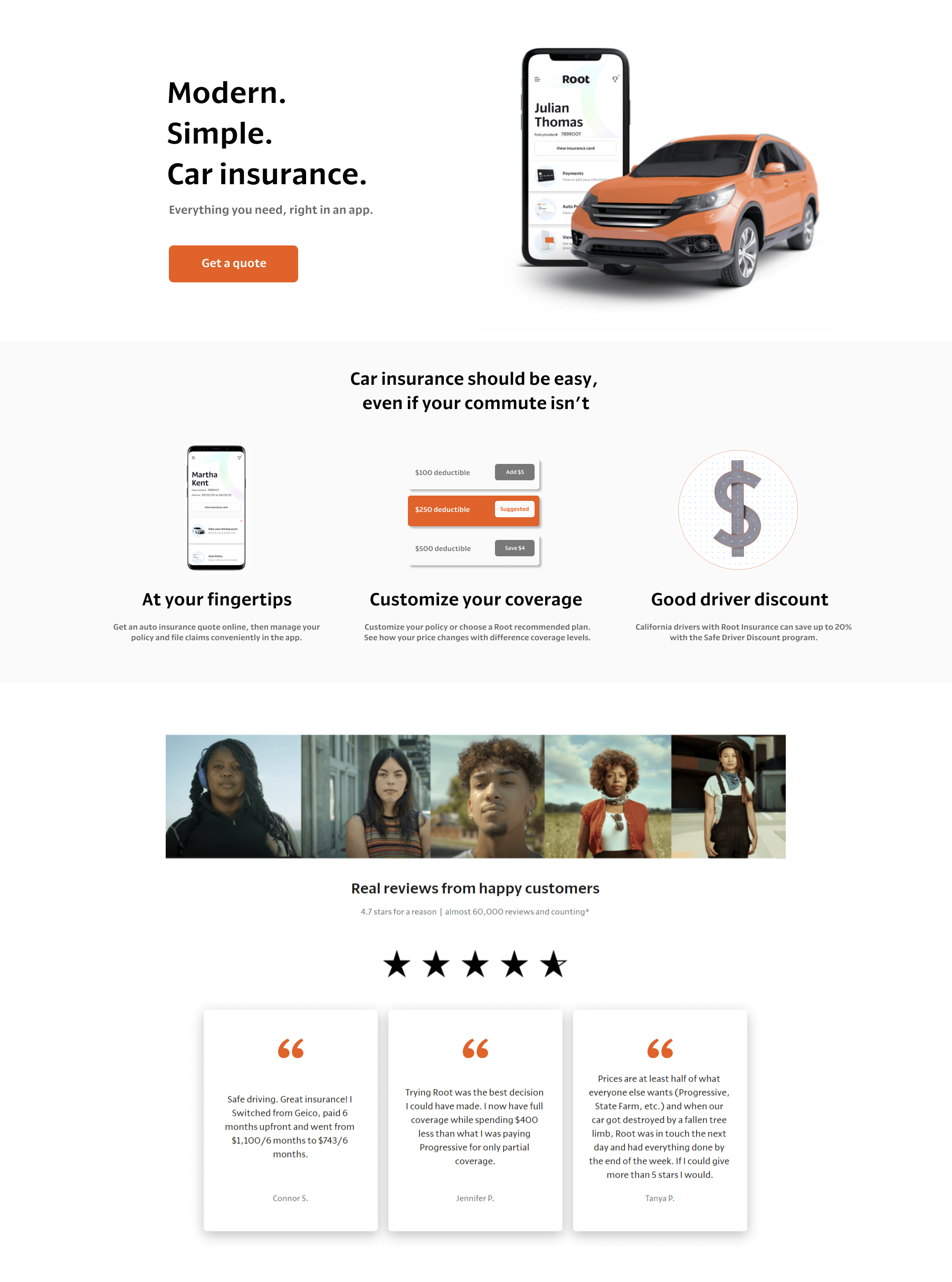
Lead with Proven copy
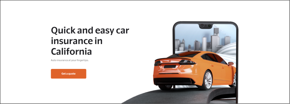
Root’s “Modern. Simple.” messaging was some of the Growth team’s most successful copy, working very well across Google, Facebook, and Paid Search. “Quick and easy” was untested, so I recommended the team go with headline copy that we knew customers responded to.
previous
updated
Update Root’s header image
Root’s all about personalizing the car insurance experience for the customer, which the original image doesn’t necessarily portray.
Instead, I believed displaying the Root app home screen would be a quick and efficient way to connect the customer to the product on a much deeper level. It would not only introduce the customer to Root’s user experience, but it would also give them the chance to imagine their own name on the screen.

use more product driven imagery
Instead of telling customers the quote or claims process through generic icons and text blocks, this was an opportunity for Root to use their own product imagery and tell a more personal story.
previous

updated

previous

updated

adding in customer testimonials
A few months back, a different Root team had run a test to measure if adding customer testimonials to the organic homepage could increase profile sign-ups. The change yielded a +7% jump in profile creation. I thought why not add this segment to the Growth marketing landing pages if it had such a positive impact, so I tweaked the layout and added photography.

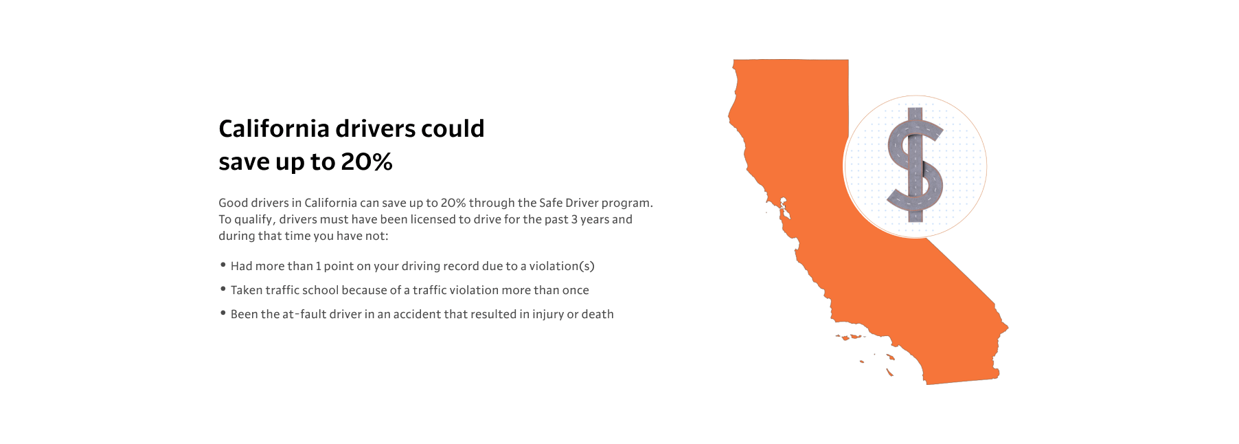
Combining redundant content
I felt the last two segments could be condensed down into a single, more powerful section centered around saving the California driver money - a final selling opportunity for Root to the customer.
previous

updated
